2023 // Personal // Design and Human-centered Design
A Destiny 2 UI update pitch. Inspired by a YouTube video where someone updated the in game director menu. The new menu design is intended to reduce visual noise and create a clearer visual hierarchy for the weapon inspect menu. There are still plans to update more menus for accessibility and organization in the future, but this is primarily for practice and understanding game menu organization and psychology.
– Objective –
Update a Destiny 2 weapon inspect menu in order to clean up visual clutter and focus, in order to allow players’ focus to naturally move across based on the hierarchy of information, and add addition important information about the weapon. In addition to that, get more practice in rapid iterations and UX design research and design.
– Approach –
There weren’t any formal tests performed, if I had the ability to I really would’ve loved to perform a eye tracking test to see what information was prioritized by some players. I did do very casual questions among friends who played and didn’t play Destiny 2 to get their feeling on the menu.
One of the most consistent complaint from people who didn’t play was that everything felt disconnected and scattered. The fact stats and perks occupied different parts of the screen left them feeling a little discombobulated and confused about what to focus on. People who played Destiny 2 didn’t really have a complaint, mostly due to the fact that it’s what they’re used to and they’ve learned how the menu works. They were able to communicate which parts of the menu were most important to them though. The weapon perks, master work, and stats were all they focused on when opening up the inspect screen.
After asking some questions to friends, I began researching how other game present this type of information. Then began breaking down the menu into it’s important pieces and then begin iterating on new designs,
– Work Completed –
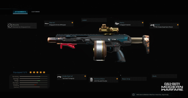
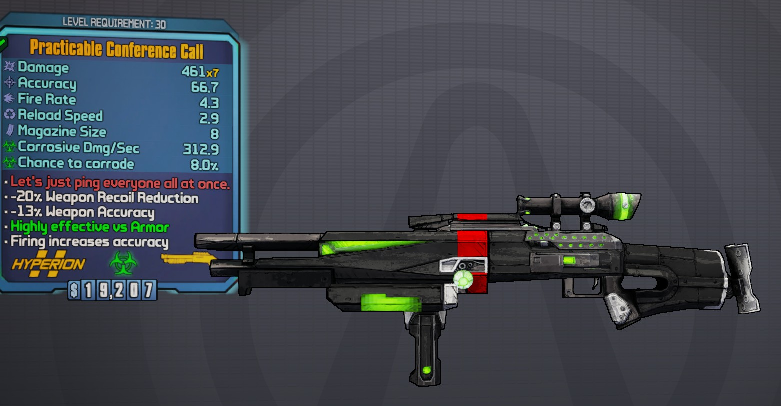
I looked into how different games in the looter and/or shooter genre designed their menu’s to get an idea of how others in the space approached this type of menu. Essentially performing research and competitive analysis. I looked at Call of Duty, Borderlands, Anthem, The Division, and even an old build of Destiny 1.

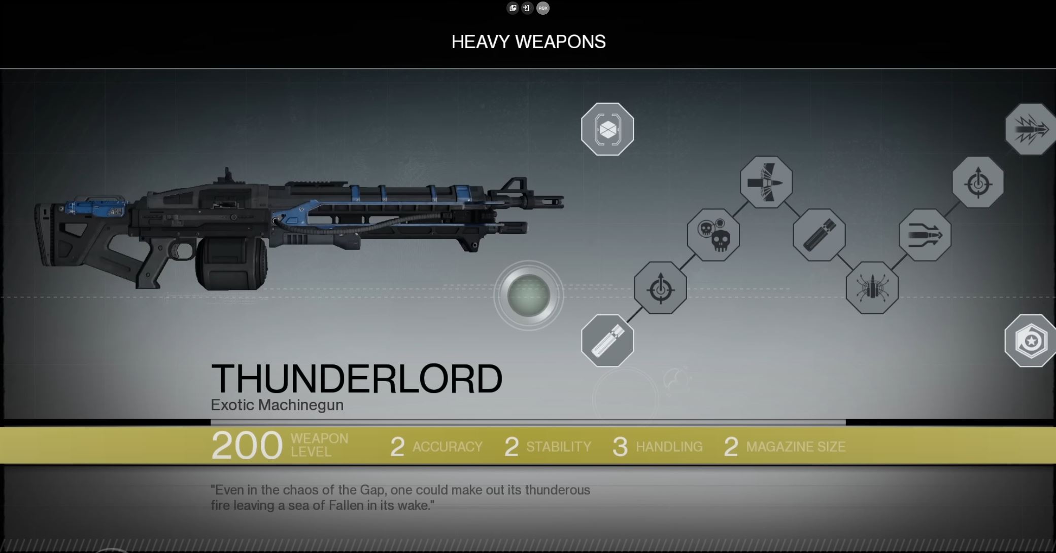

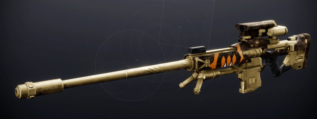
I do think that Destiny 2’s current inspect is one of the best among these, even if it’s a little disorganized. One of the important things to keep in mind is that Destiny’s inspects contain more elements that require decisions from the players, so comparing it to other games’ weapon inspects is difficult as they don’t serve the exact same purpose.
The Division’s menu was the closest since the game is a looter shooter where the weapons have different talents in addition to the other stats. The most important take away from this games menu is the organization of the stats, since it’s all organize in one tab your eyes naturally read down all of the information. Even though I’ve never played the game, the organization and hierarchy are very intuitive to read. I think it looks cramped being organized vertically, so I intend to approach Destiny’s menu with a horizontal orientation, reading left to right. There can be an issue with that with localization, but since English speaking countries populate more of the game, it should work fine.
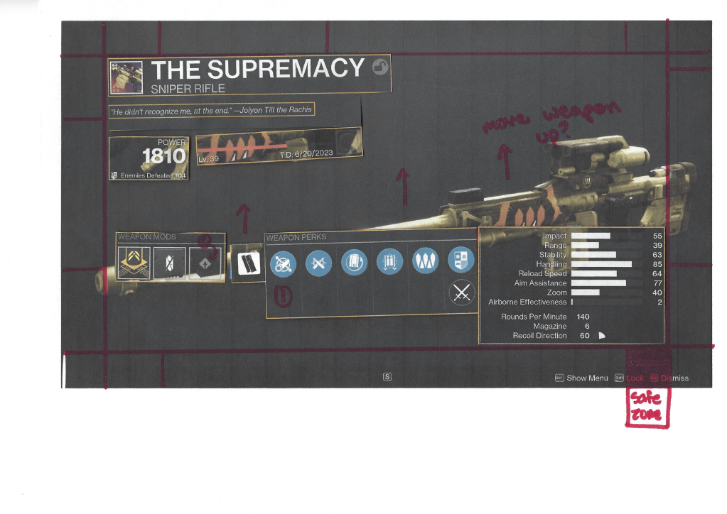
I moved on to mapping out the current menu to box out the different focus areas to better understand which areas are the most important. With these areas in mind I actually decided to print out the page to make notes on the menu as a whole.

After that I wanted to begin working on a new design, but had the idea to use another version of the page and cut out each area to then reorient them onto a clean plate of the sniper. This really helped with rapid prototyping as I got a great sense of scale and was able to move things around effortlessly. Below is the collage that I made after moving each item around.
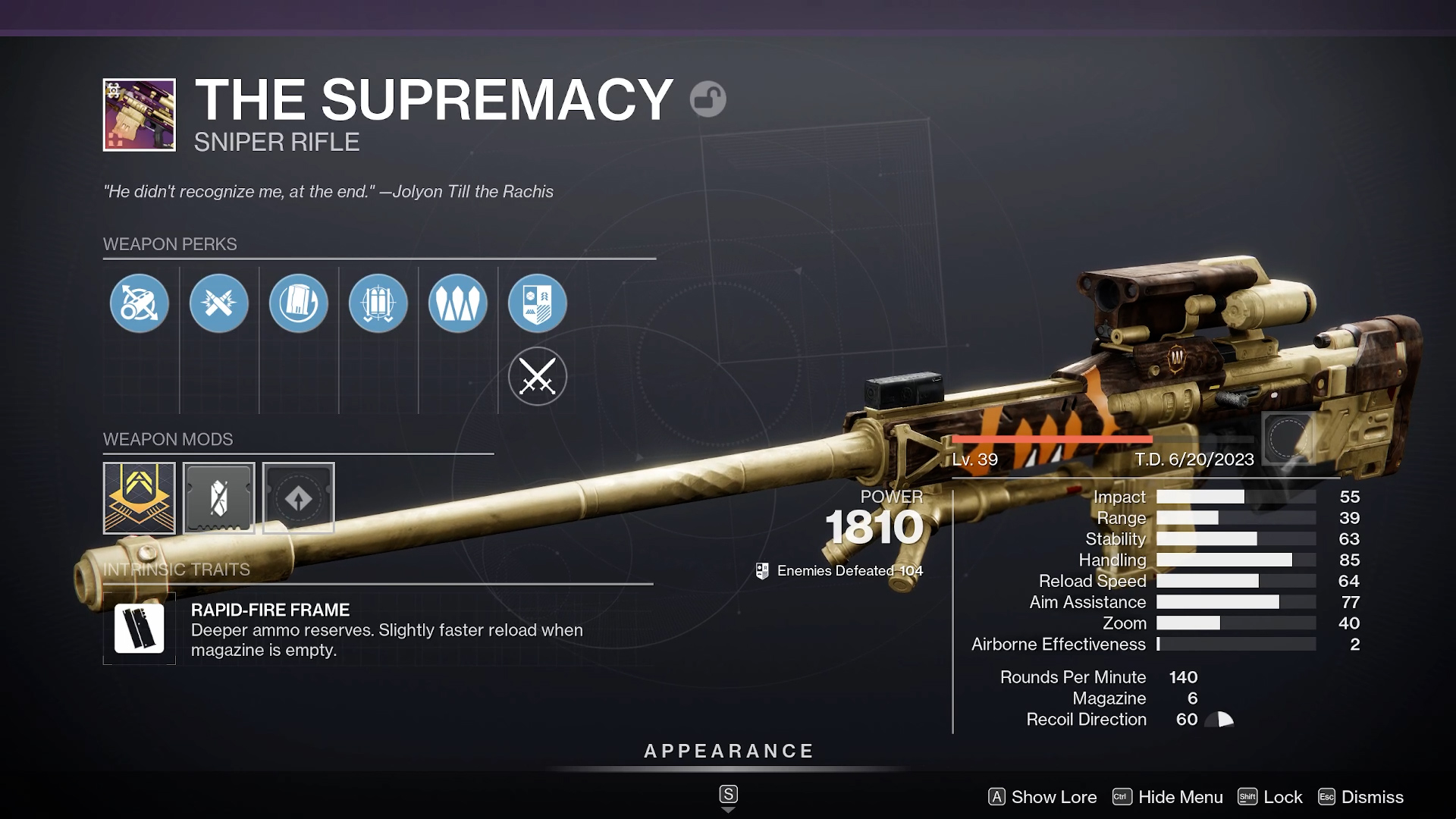
I took this idea and began working on a design in Photoshop to get a better idea of how it would look. I continued working on that design for a couple days in my spare time and came up with the design below. (The original menu is after it in the slideshow)
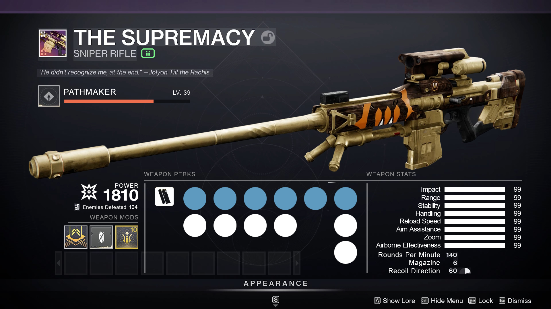
I tried to avoid resizing as much as possible, but did reduce the size of the mod icons in order for them to fit. To avoid the menu icons overlapping the weapon, I did raise its height. I tried to use some of the feedback about the masterwork being one of the most important reasons that people open this page since it doesn’t show it on the hover interaction in game. I also tried my best to respect the safe areas on the screen when creating the drop down menu for the weapon mods section (that what that set of transparent boxes represents). Two nitpicky things that I decided to add was the kinetic damage and the special ammo symbol as I think they are important pieces of information to add.
– Retrospective –
Overall, I think the new menu looks great, I’m really happy with the organization and I think it’s really cleaned up! I showed to the same friends and even some new ones to get their opinions on it and it was received very well. Someone who had never played the game thought that this was the original when I was showing it to them, which was super flattering.
This was intended to be a one-off, to get me out of writers/video block for Dragyn which has been haunting me for over a year now, but working on this project really made me want to do more of these! I really geek out over ergonomics and usability (human-centered design changed me…) and I think I want to explore more of these types of projects. Getting to critique and update these menus based on usability is something that really excites me. I’m looking at making an update to the armor inspect and subclass menu in Destiny 2 as I think those could use some changes based on accessibility. After working on those as well, I’m planning on hopping into Figma to put together prototypes for each of those.
