2021 // University // Design and Human-centered design
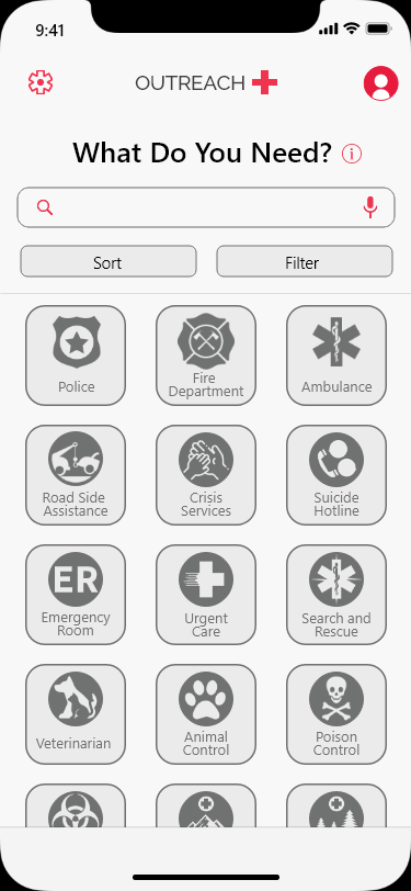
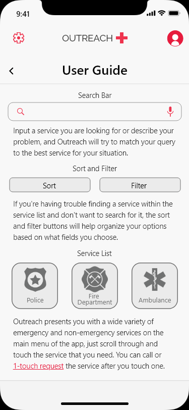
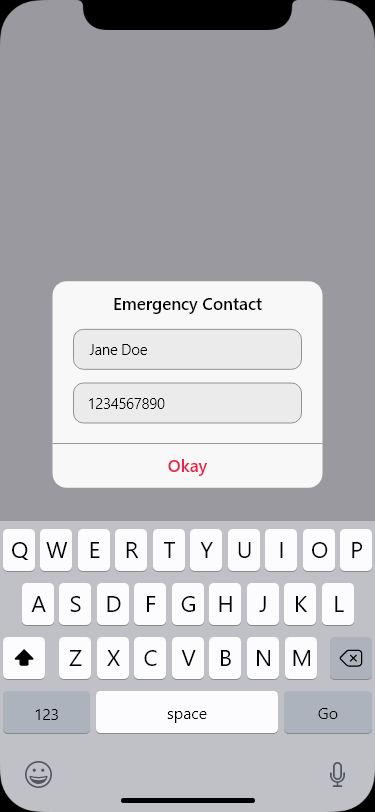
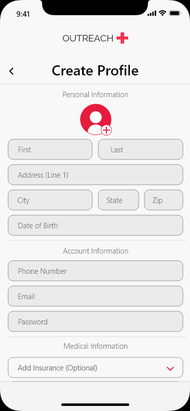
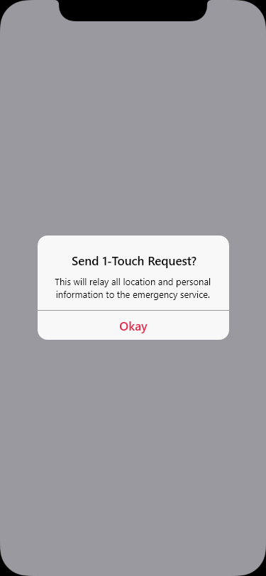
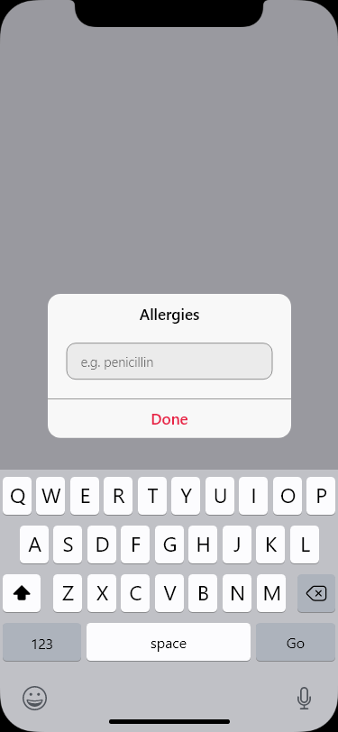
An Adobe Xd prototype for the Reimagining 911 project that was held in 2021. The app consolidates different emergency services on one page so that the user can find the correct service that fits their needs.
– Objective –
911 has been increasingly misused for non-life threatening emergencies. Although no comprehensive data is collected at the national level, there is data at the local level that suggests a severe misuse of emergency services (National 911 Program). For example, in the Midwest, nearly half of 911 calls were non-emergencies. This pattern is replicated in other cities, such as San Diego, California (Sampson). The general public needs a way to report non-life threatening emergencies to the correct local agency, so that their concerns are screened and addressed appropriately.
– Approach –
This project spanned most of the semester in my interactive media course (That class actually inspired me to make this portfolio site!)
The professor is a UX Designer, so they wanted us to follow as many design methodologies related to user experience as possible. This included competitive analysis, user journey flowcharts, and prototyping, which I completed in that order. The assignment also called for us to use the iOS material design guidelines when creating our prototypes. This class also allowed me to flex some human-centered design muscles too, which I was ecstatic about.
– Work Completed –
I wanted to truly understand the purpose of the reimagining 911, so I looked at the website and began understanding and empathizing, and this line stuck out to me and immediately made me invested in this project and the movement.
“…when a person is experiencing a mental health crisis, 911 dispatchers send armed police officers as a default response. We don’t send armed police when someone is experiencing a heart attack, but we do when a person is experiencing suicidal ideation.”
I can’t find them now, but people’s experiences with this issue were equally as impactful. A one size fits all approach rarely works in any context, so why should we be taking that approach with such a sensitive subject?
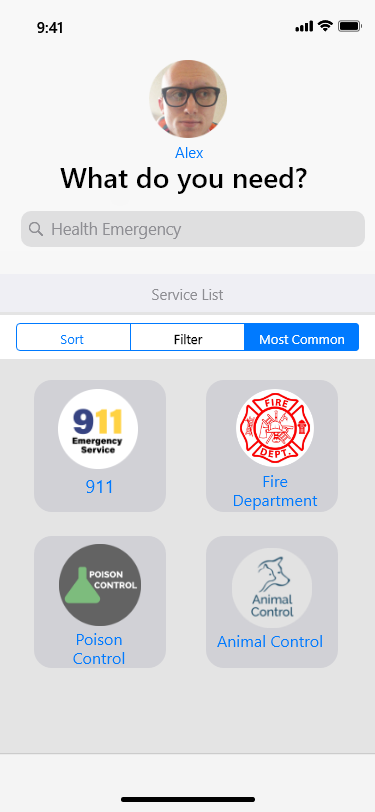
After some ideation, I came up with the idea for Outreach, what if in an emergency a person could contact the most appropriate service that they needed in that given moment? An app that presented the user with a variety of different emergency services they they could choose from would be a great start to get the person the assistance that they needed.
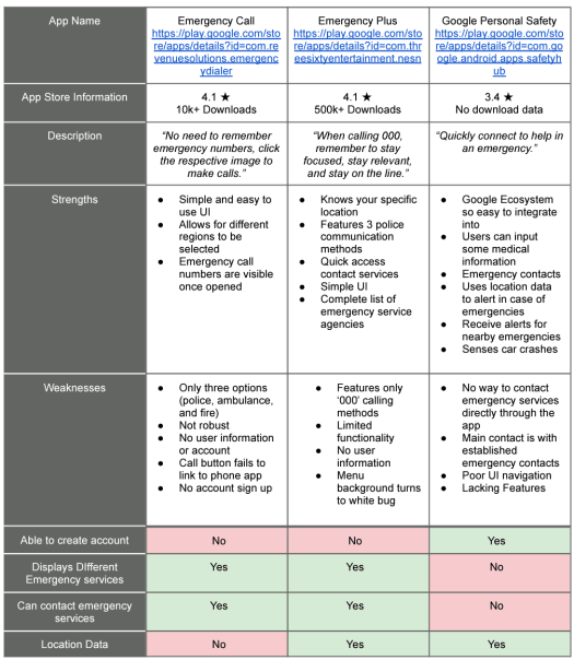
I began to work through the competitive analysis to understand the landscape of this type of app, and there were a few that occupied the same space that Outreach would.
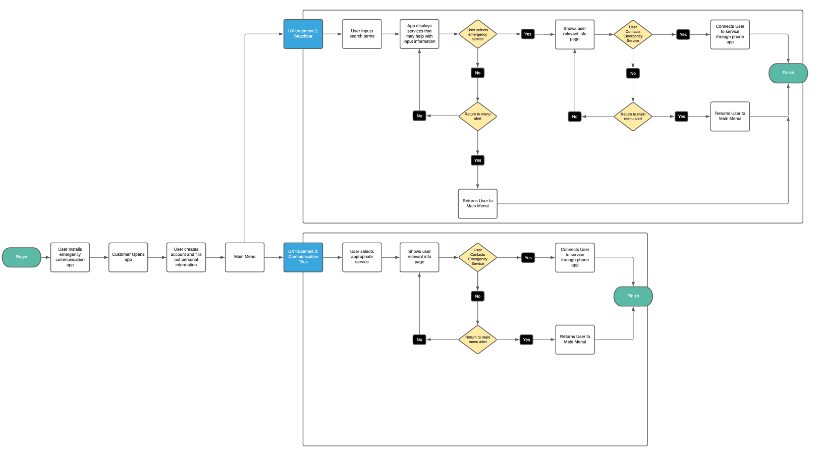
After that, I worked on the user journey flowchart. My goal was to design a streamlined system that didn’t get in the way of the user trying to contact a service considering they will probably in an emergency scenario.
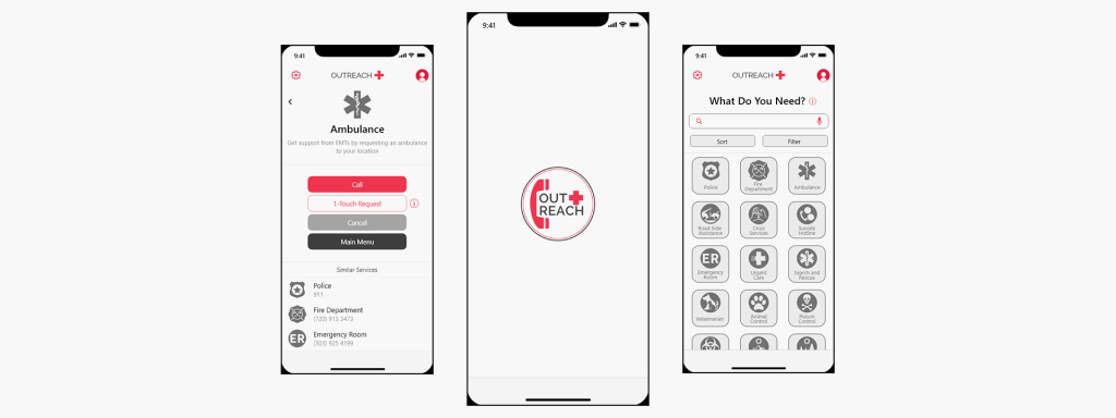
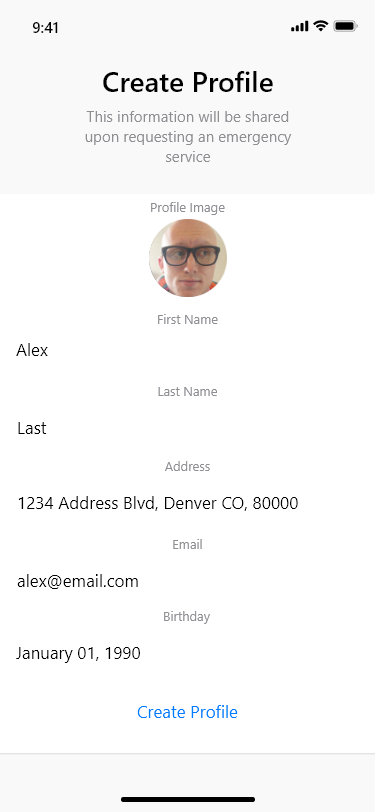
With these completed, I found the documentation for Apple’s human-interface guidelines and downloaded the Adobe Xd templates in order to start working on my prototype. Below is what I submitted. The images were originally part of a prototype in Adobe Xd, but I completely remade the prototype for the final submission.


This could’ve been the end of the project, but our professor gave us the option to continue working on this project instead of moving on to a different one. I opted to continue working on Outreach since I wasn’t fully satisfied with the design of the app and I was invested in the redesign 911 mission.
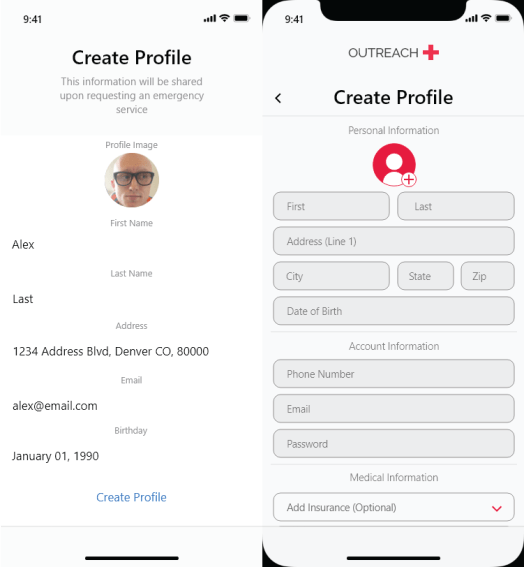
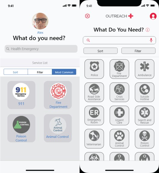
To begin I needed to redesign the app. Since we participated in critiques, I had received some helpful feedback for the design. The three individuals liked the layout and the simplicity, but all of them thought that the app felt old, and looked like “a stock application on an iPhone 4”. That was the best piece of criticism I could’ve received because I felt it too, so my goal for the next check-in was to redesign the previous screens with new material design and create a more modern and cohesive design. The images below are what I submitted, the left is the old and the right is the new.
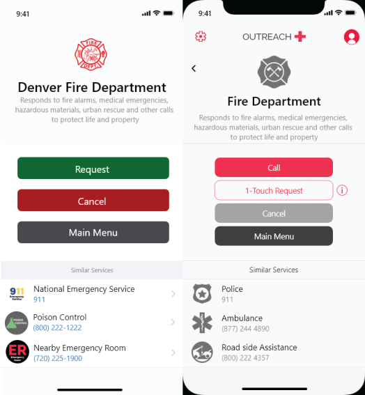
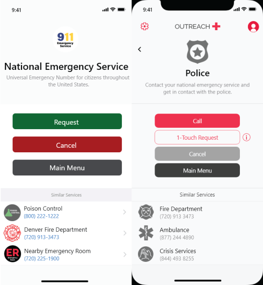
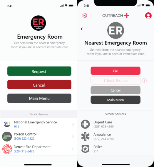
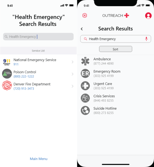
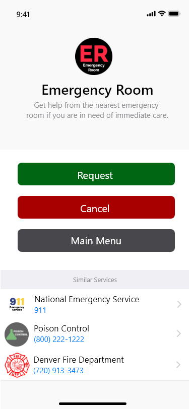
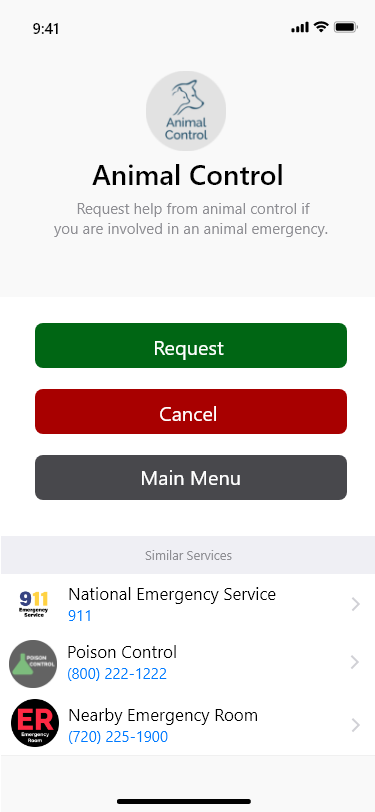
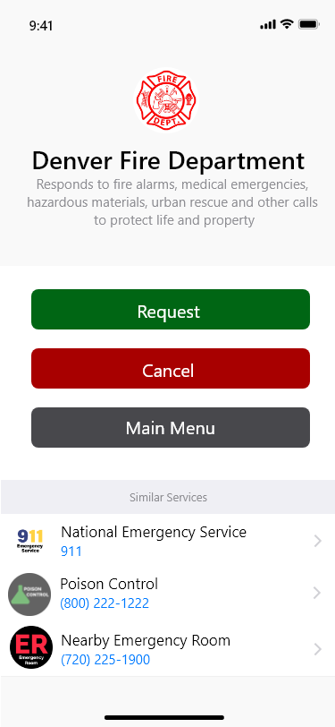
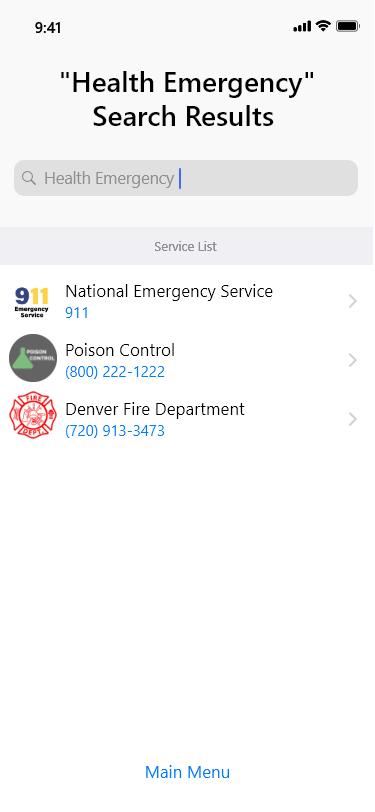
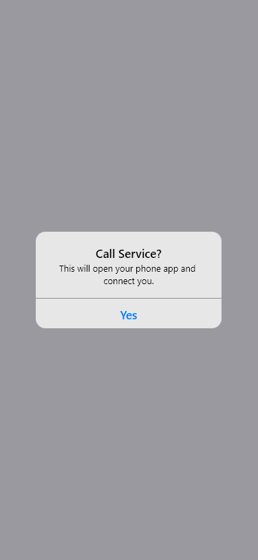
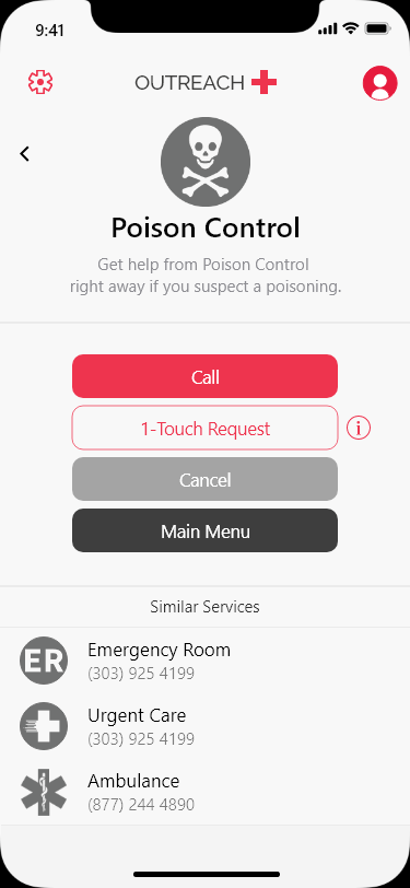
The new designs were received well, so I began working on the rest of the app, trying to make the prototype represent a complete experience. Below is a slideshow of some of the prototype pages as well as a link to the Xd prototype.

– Retrospective –
Interactive media was one of my favorite classes in college and it taught me so much about design, development methods, and even agile methodologies. It opened my eyes to qualitative vs quantitative testing for UX research and allowed me to iterate on prototypes, which is something that I hadn’t done since my human-centered design class in my second year of college.
I had never used Adobe Xd for any project before, and through completing this project, I went in to working on the Candy Mountain prototype with so much confidence. These type of prototyping tools are incredible and I just scratched the surface of Xd in this project.
Looking back, I feel like this app could benefit from some of the new technologies that are becoming prominent now in. A chatbot that the user can interact with to describe their issue and then get a recommendation based on what they typed in would be so helping while using Outreach, since a user may not know which service to contact depending on their current situation. It might add sometime to getting the user connected to the emergency service that they need, but I think it would be a great addition to this prototype.
